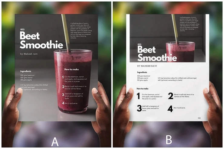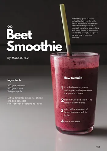
Most went with A, some chose B, and many shared great reasons for their choices. Here’s a little design insight for enthusiasts:

Choosing between A and B depends on the objective. Layout A, with its emphasis on imagery, might suit a photographer’s book on recipe photography. Layout B, which highlights step-by-step instructions, could work better for an easy recipe book. The layout’s final application—where and how it’s used—matters, too.
For instance, you might prefer A at first glance because it’s eye-catching and aesthetically appealing. But imagine an entire recipe book laid out this way—it might feel overwhelming! While A works well as a standalone, it may not suit a continuous layout.
That’s where B comes in. It’s easy on the eyes, readable, organized, and has ample negative space. Plus, its design isn’t tied to specific images, so it’s versatile across multiple pages.
